
Summary
What should be on a homepage depends on the brand, business model, customer journey, and how much people already know about the organization. But there’s a useful place to start: a homepage should help customers answer four questions. What a website homepage should include depends less on a list of sections and more on the questions customers need answered. Who are you? What do you sell? Why are you right for me? And where do I go next?
Those questions stay fairly consistent. The amount of attention each one needs doesn’t. A newer direct-to-consumer (DTC) brand may need to work harder to introduce itself and build trust, while a familiar retailer, nonprofit, tourism organization, or enterprise brand can move more quickly into products, services, programs, campaigns, and priority journeys. The goal is to make it easier for the right people to understand what matters, find the right path, and take the next valuable action.
What is the job of a homepage?
Homepage planning can quickly become a fight over who gets a spot on the page.
There’s a campaign that needs visibility, a new product launch, a brand message, a corporate initiative, a promotion, a featured category, and probably a few stakeholder requests that have been hanging around since the last redesign. On large enterprise websites, that list can get even longer because multiple business units, markets, products, and internal teams are all competing for attention.
The problem is that a homepage can’t give all of those things the same weight. If everything is important, nothing is important. More importantly, just because the organization wants to say something doesn’t mean the customer or audience needs to hear it at that point in their journey.
For many ecommerce, DTC, enterprise, nonprofit, and service websites, the homepage is partly a triage environment. It helps people get their bearings, understand enough to keep going, and find the right way into the rest of the site.
And when the website has a commercial job, that orientation needs to lead somewhere. People need to be able to find products or services, narrow their choices, and ultimately buy, book, subscribe, apply, donate, or take another meaningful action. Baymard Institute’s ecommerce usability research shows that customers use homepage content to understand what kind of site they’ve landed on and the range of products available to them.
So rather than starting with, “Do we need testimonials?” or “Should we add a best-sellers section?”, it’s more useful to start with the questions the customer needs answered.
What four questions should a homepage answer?
Max Abuyuan recommends using four questions as a starting point for homepage strategy.
1. Who are you?
Someone landing on the site should quickly understand where they are and what kind of organization they’re dealing with.
How much explanation that takes depends heavily on awareness. A newer DTC brand may need to establish its identity, point of view, and relevance quite quickly. A major retailer, established nonprofit, or well-known enterprise brand may already have that recognition and can spend less time introducing itself.
What should be above the fold on a homepage? Enough to help someone understand where they are, what you offer, and why they should keep going. “Above the fold” isn’t a magic box where every message and call to action needs to fit, but the first screen still has an important orientation job. If someone lands on a page and can’t tell what the organization sells, offers, does, or stands for, asking them to scroll won’t fix the problem.
That clarity also matters beyond the human visitor. Clear homepage content, descriptive headings, meaningful internal links, and an understandable site structure help search engines and AI systems identify what the organization offers, which topics matter most, and where deeper information lives.
2. What do you sell?
This sounds obvious, but plenty of beautiful homepages make the actual offer strangely hard to figure out.
Depending on the organization, the answer might come through product categories, best sellers, services, programs, solutions, use cases, industries, destinations, or another useful view of what’s available.
Owala can move quickly into best sellers and shopping paths because the product is easy to understand. Stripe has a more complex job, so it explains the broader offer, then gives people clear paths into products, solutions, and different business needs.
Tourism sites have a similar challenge. Tourism New Zealand doesn’t “sell” one product. Its homepage has to turn a huge destination into useful ways to start planning, such as itineraries, seasons, experiences, accommodation, and travel information.
That’s information architecture doing useful UX work, but it’s also good for growth. People aren’t just being shown what exists. They’re being helped toward the product, service, destination, or solution that’s most relevant to them, which makes it easier to move from browsing to action.
3. Why are you right for me?
This is where brand, benefits, differentiation, values, relevance, and trust start to work together.
Brand story is often misunderstood here. It doesn’t have to mean an “Our Story” block, a founder biography, or a brand house translated into customer-facing marketing language. The useful parts of the story are the things people have a reason to care about. What makes this different? Does it solve my problem? Do I relate to this organization? Do its values align with mine? Do I trust it to deliver?
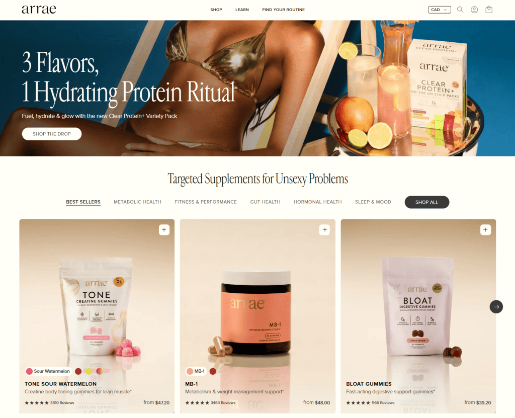
Arrae is a good example of a commerce brand where product, problem, voice, and selling are tightly connected. Its positioning around “targeted supplements for unsexy problems” gives the brand a distinct point of view, while benefits, products, and shopping paths help customers decide whether it’s right for them.
For Girls Who Code, “right for me” means something different. Its mission, programs, impact, and vision make it clear what the organization stands for, whether you’re a student considering a program, a potential partner, or someone thinking about donating.
On an enterprise website, the same question might be answered through customer outcomes, industry expertise, case studies, integrations, security, scale, or other proof that reduces the risk of choosing the company. GitHub does this by showing the breadth of what teams can build on the platform, while reinforcing trust through scale, enterprise capabilities, security, and developer credibility.
The content changes, but the job doesn’t: give people the reasons they need to feel that this is the right organization, product, service, or experience for them.
Brand shouldn’t be confined to one storytelling module either. The language, imagery, proof, interaction, content choices, and hierarchy all contribute to whether the experience feels credible and recognizably yours. That relevance and trust matter commercially too. The easier it is for someone to understand why the organization is right for them, the easier it is to move from awareness into consideration, and from consideration into action.
4. Where do I go next?
Once someone understands enough to keep going, the homepage should help them figure out what to do next.
That might mean choosing a category, browsing best sellers, taking a quiz, using a product selector, learning how a subscription works, searching for something specific, or adding something directly to cart. For example, Glossier makes it easy to browse by product category, shop best sellers, take a quiz, or find products based on specific needs. On a B2B or enterprise website, it could mean exploring an industry, reading a customer story, starting a trial, or booking a demo. On a nonprofit site, it might mean finding a program, volunteering, partnering, or donating.
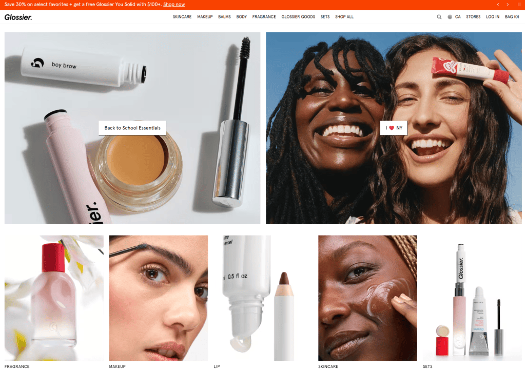
This is where interactive-first homepage experiences can be especially useful. If people aren’t sure which product, service, program, or solution is right for them, a quiz, selector, guided path, planner, or “shop by goal” experience can sometimes do more useful work than another block of marketing copy.
Airbnb is an extreme version of this idea. Its homepage is essentially an interactive starting point. People choose between Homes, Experiences, and Services, then immediately start defining what they’re looking for. The interface itself answers “Where do I go next?”
The homepage doesn’t need to complete every customer journey. It needs to give people enough clarity and confidence to enter the right one, whether that journey ends in a purchase, booking, signup, donation, application, trial, or sales conversation.
Does every homepage need the same hierarchy?
No, and this is where a standard homepage template starts to fall apart.
A less-known brand may need to spend more time establishing who it is, what makes it different, and why someone should trust it. A well-known retailer may be able to give much more prominence to campaigns, promotions, new collections, or seasonal priorities because the customer already knows the brand.
A nonprofit may need to balance people looking for help, people looking to participate, donors, partners, and supporters. A tourism site may need to inspire someone who’s still dreaming about a trip while also helping another visitor who’s ready to book. Enterprise websites may need to serve prospects, existing customers, partners, developers, job seekers, and multiple industries at once.
That makes prioritization more important, not less.
Customer need should still govern the hierarchy, but brand and business growth priorities don’t have to compete with it. The strongest homepage ideas can do both, helping the customer while also moving an important product, service, campaign, or business objective forward.
Say sustainability is a major strategic priority for the business. That doesn’t automatically mean the homepage needs a large corporate section explaining the sustainability strategy. Patagonia is a good example: its Worn Wear program lets customers repair, reuse, and buy used products, giving people a practical way to participate in the brand’s sustainability commitments while also communicating something important about what Patagonia stands for.
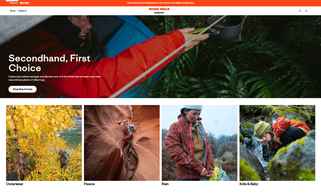
That’s usually the more interesting homepage problem to solve: not “How do we fit everything in?” but “How can one piece of content do more than one useful job?”
What makes homepage design difficult?
The homepage has to establish hierarchy visually, accommodate different kinds of content, create useful paths into the site, support conversion and growth priorities, and still feel like the brand. On enterprise and institutional websites, it may also need to balance multiple audiences and a much broader content ecosystem. And it has to do all of that on a phone.
Mobile makes prioritization more important. There is less room for context, navigation is more limited, and a short desktop page can become a long scroll. On Headspace, that might mean showing the main goals, such as sleep, stress, focus, and meditation, before explaining the service in more detail.
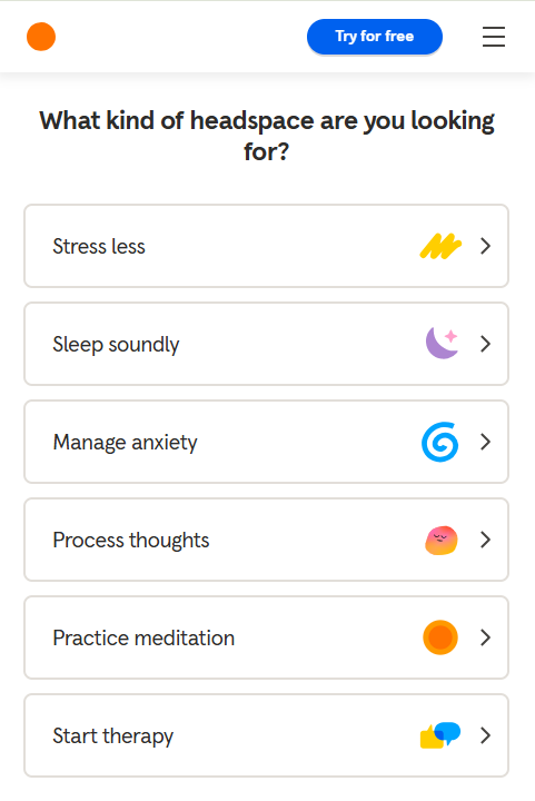
That doesn’t mean making the mobile homepage tiny. It means prioritizing the value proposition, key paths, and essential proof, then using progressive disclosure for deeper content. The goal is to make the sequence of decisions easier to follow.
This is also where visually distinctive brands such as Snif and Poppy & Peonies are useful examples. Their homepages aren’t branded because they contain a single storytelling section. The brand comes through in the typography, imagery, product presentation, merchandising, copy, and overall rhythm of the experience.
The same structural decisions matter for SEO, AI visibility, discoverability, and growth. Clear headings, understandable categories, meaningful internal links, descriptive content, and a homepage that accurately reflects the site’s core topics make it easier for search engines and AI systems to understand what the organization offers. That can improve discoverability while also helping people move more naturally into the deeper pages where decisions and conversions happen.
Content strategy should inform what needs prominence, what can be compressed, what deserves an interactive treatment, and what should move deeper into the site. The wireframe and visual design then have to make that hierarchy understandable.
How do you decide what deserves space on the homepage?
When everything is important, than nothing is important. To get to a better homepage start with one question:
If taking it off changes nothing for the customer, does it deserve to be on the homepage?
That doesn’t mean the content is useless. It might simply mean the homepage isn’t the right place for it.
A homepage only has so much attention to work with. It should make the key points, help people shop, choose, plan, participate, or take the next step, then let product pages, solution pages, program pages, destination guides, FAQs, and other deeper content do the more detailed work.
That’s even more important now because the homepage isn’t everyone’s front door. People may arrive through search, social, campaigns, direct links, and increasingly AI-driven discovery, landing directly on a product page, solution page, program page, destination guide, or article. As AI changes how people discover and explore websites, that broader site experience matters even more.
That changes how homepage strategy should be thought about. The homepage still needs to clearly communicate the brand, offer, and major paths, but the broader site has to carry that clarity too. Good homepage structure should connect naturally into a site architecture that humans, search engines, and AI systems can all understand.
The homepage still matters. But it doesn’t need to tell the whole story. It needs to tell enough of the right story to help someone understand who you are, find what’s relevant to them, trust that they’re in the right place, and move forward.
How can a better homepage support growth?
A good homepage isn’t just there to make the site look polished. It should help the business grow.
When people can quickly understand what you offer, see why it’s relevant to them, trust the brand, and find the right next step, there’s less friction between arriving and acting. For ecommerce, that might mean getting someone into the right category faster, surfacing a best seller, helping them choose through a quiz or selector, or giving them enough confidence to add to cart.
But growth isn’t only about the immediate sale. A strong homepage can also introduce a new product, move people into higher-value services, grow subscriptions, generate leads, increase donations, support a campaign, or help an unfamiliar brand earn consideration in the first place.
It can also strengthen discovery. Clear content, strong internal pathways, and a homepage that accurately reflects what the organization offers give search engines and AI systems better signals about the site, while helping people who arrive directly understand where they’ve landed.
That’s why homepage strategy is a growth decision, not just a design or content exercise. The goal isn’t to squeeze more onto the page. It’s to make the brand easier to understand, the right offer easier to find, and the next valuable action easier to take.
Sources
- NewBrains, Stop Organizing Your Website Like Your Company
- NewBrains, When AI Gives Us Every Answer, Will We Still Want to Look Around?
- Baymard Institute, Homepage & Category Navigation UX Research
- Google Search Central, Help Google Understand Your Ecommerce Website Structure
- Google Search Central, AI Features and Your Website

